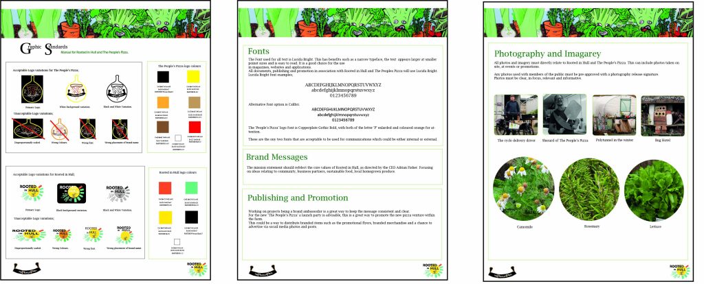
The three A4 Graphics Standards created to be both informative and easy to follow by other designers.


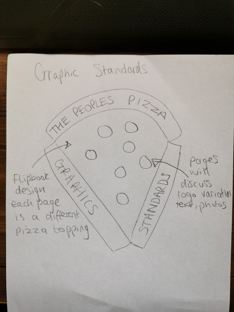
The first idea for the manual was to individually focus on both The People’s Pizza and Rooted in Hull. This is showed in the above image. This was designed to be a flip book style manual, using a pizza slice as the page. This would have different toppings for each page as the subject of discussion changed. For example, the first page would focus on logo variations showing those which are acceptable and unacceptable, the second page would focus on colours. This manual is designed to look like an independent company which is completely removed from a traditional corporate style manual.
However, this was changed to be an all-inclusive manual which will include the business partners of Rooted in Hull. This will enable all future advertising of events to be consistent to typeface, colours, photography and imagery, so that all individuals can work together to deliver their message.
The overall style of the manual is colourful and bright, it is designed to takes the viewer away from a standard corporate style standards manual. This is especially highlighted in the graffiti heading used on all three pages, this a cross section taken from the photos from the Rooted in Hull visit and used as a visual marker to represent the Rooted in Hull site.
The text Lucida bright is used consistently throughout the project in both The People’s Pizza and Rooted in Hull’s mobile application design. This typeface has benefits such as a narrow typeface, the text appears larger at smaller poinst sizes and is easy to read. It is a good choice for the use in magazines, websites and applications.
The first page breaks down the different acceptable and unacceptable logo variations from The People’s Pizza and Rooted in Hull. With each section housed within its own light green box to clearly highlight the different key sections of the manual. It is most important that the logo of both brands is correctly reproduced, as well as defining the corporate colours, this is why page one is dedicated to this subject.
The colours of nature are a main focus of the manual. Most noticeably the colour green is used for heading the text, and as a border around the photos and descriptions. This can also be noted in the photography and imagery, the photos seek to highlight nature and the activities of the Rooted in Hull city farm.

