
Megadeth – The pioneers of band webistes!

Megadeth are known as one of the first bands to have an official website. The website was designed to have a postcard asthetic, using a restricted colour pallete which was limited by the early web. The wild-west theme was insprired by the recording of Youthanasia whislt living in Arizona.
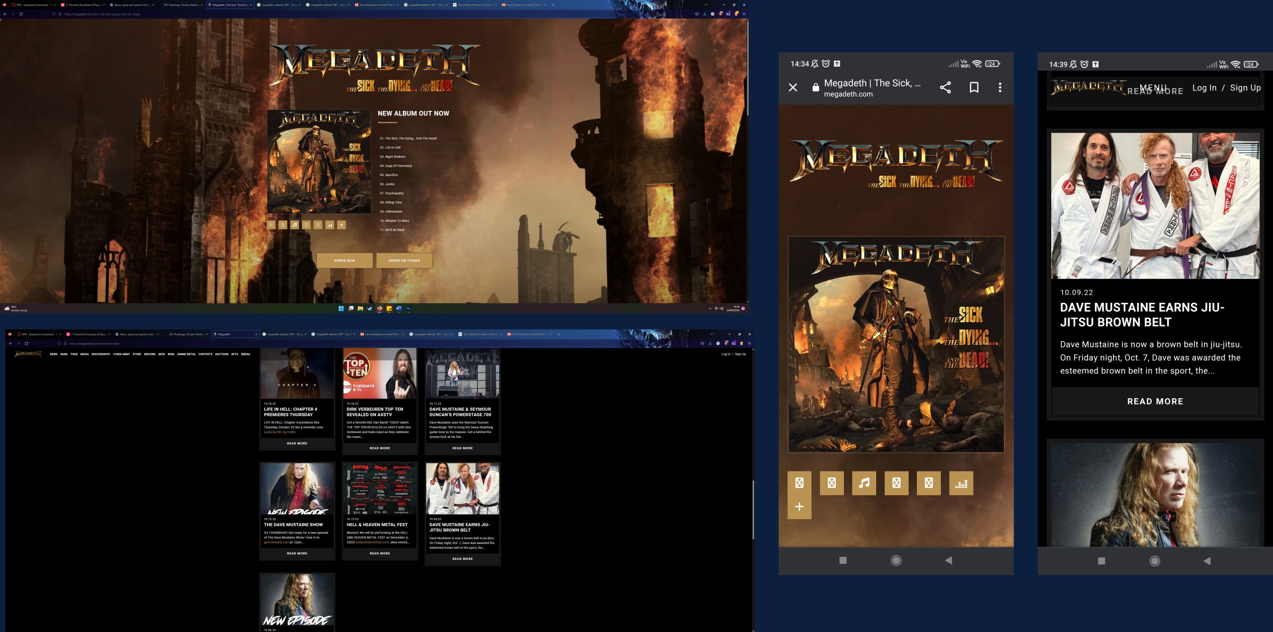
The current Megadeth website and mobile comparison above demonstrates examples of responsive designs. The content remains consitent on both devices. The full menu is visable on the website version, but on the mobile the menu is condensed through a drop down bar at the top of the screen. The page utilises fluid grids which automatically adjust to the screen size of the user, so the content maintans consistency across all devices. The grid on the website uses a three column grid compared to the mobile which uses a single column grid. This version is much more interactive than the original 1997 design. Most notably the use of high resolution images and visuals create a striking website.
UFC
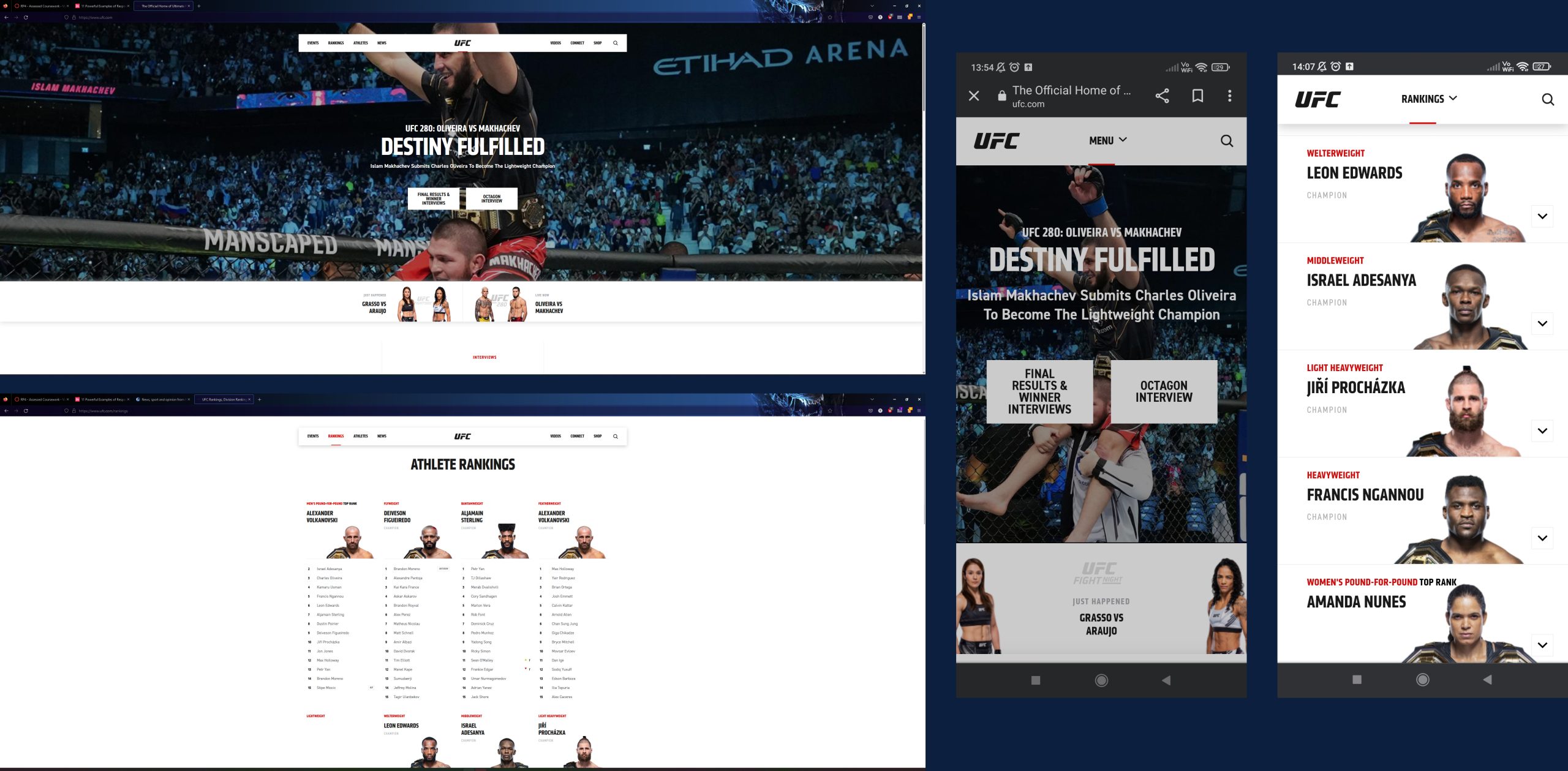
The webiste features a flexible grid which condenses acrross different devices. There are some notable changes in the mobile version. Instead of having a flexible visual, the app uses a cropped version of the header image on the website. The rankings page as an examples has a drop down menu style design to show the information in a single column layout, wheras the website version has the information displayed in a four column layout. This is different from the fluid grid as it uses a different style of layout on mobile to the website version. This makes the information easier to read on a mobile, as the rating in a drop down style bar ensure the text is ledgible and simple to locate. On the website when the mouse is hovered over a news item or video the image will slighlty zoom in, on the mobile version the same clickable images will flash fade from the bottom to the top of the image.
The Guardian
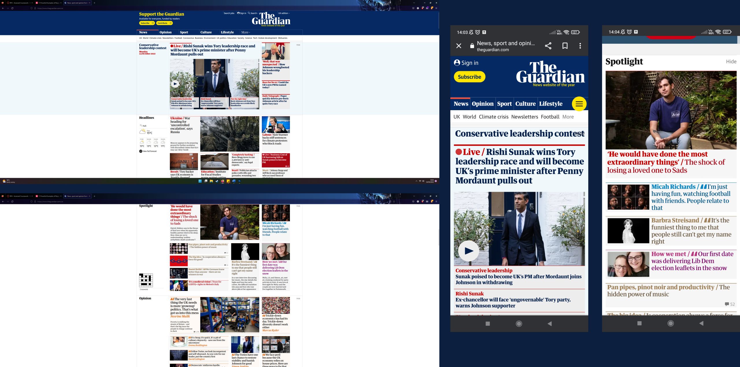
The Guardian website utilises many examplesd of responsive design. The website uses a five grid layout for the information at the top of the home page, which changes layout as the page is scrolled down. The icons of the page are responsive when the mouse moves over, the play button on the video has an animation to get larger, to encourage the user to click on the button. This feature is not present on the mobile version as a mouse is not present. The mobile version uses a single grid layout with the same information condensed as a scrollable single grid layout.
References
Home. n.d. [Online] Available at: https://thehistoryoftheweb.com/the-unlikely-pioneers-of-the-early-web/ (Accessed 23 October 2022)
Home. n.d. [Online] Available at: https://megadeth.com (Accessed 23 October 2022)
Home. n.d. [Online] Available at: https://www.invisionapp.com/inside-design/examples-responsive-web-design/ (Accessed 23 October 2022)
Home. n.d. [Online] Available at: https://www.ufc.com/ (Accessed 24 October 2022)
Home. n.d. [Online] Available at: https://www.theguardian.com/uk (Accessed 24 October 2022