Part 1 – The Participant
https://www.dropbox.com/s/gw7hw120lpqibv2/2022-12-05%2012-18-53.mp4?dl=0
Part 2 – The Designer being Evaluated
The evaluator was given a list of 9 tasks to complete on their assesment, they are as follows below;
1· Locate a post or a category of post
2· Find out more about the designer of the site
3· Visit a piece of work from Year 1 via the menu
4· Save a photo
5· Expand an image in a post of your choice
6· Go to the Brutalist post and find the references
7· Play a small part of a video in EX3
8· Find out when a post was posted
9· Find a post from Year 1 Rooted in Hull
The user completed the tasks without assistance and recorded their results in the video above. There was no direction given other than the 9 tasks provided. It is important to not give any direction other than the tasks given, so their attention was not directed to any particular part of the website or pages. If any hints were given the test results would be compromised and therefore unreliable.
After review of the video, the evaluator mostly had success completing the tasks given. The evaluation shows that the website has good utility as it provides full functionality of the features needed to carry out the tasks. Overall it was easy for them to accomplish the tasks the first time they encounter the design, even though some content on the posts were missing. They were able to learn the design and efficiently perform the tasks, this is because the menu bars all had the correct functionality to navigate between posts.
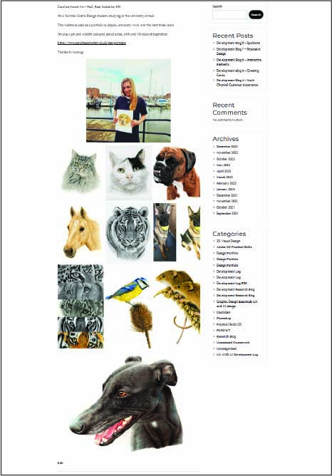
However it was made clear that the student could not locate any information about the creator of the website, this has now been updated. The home page features a small write up about the artist, with a link to her website and some examples of her work. These can be clicked to enlarge the image to full screen.


Another change to the website layout was the naming of the categories. There were duplicate ‘Development Logs’ which meant that saving a new post into a Development Log meant that the post could be in the wrong module. This was corrected by renaming the individual Development Logs to avoid confusion. As an example, the Rooted in Hull Development Log can now be easily located as it has been renamed to “Development Log RIH”. This acronym of Rooted in Hull clearly defines the contents of the development log and means that posts can be more efficiently put in the correct place.
The user could not locate any information on the Pinterest page on the menu tab, this is there however there is currently no content available, which is something to be worked on for the future.
Based on the article by Jakob Nielsen (Usability 101: Introduction to Usability) “to identify a design’s most important usability problems, testing 5 users is typically enough.” This means that these small style usarbility tests can be more useful in identifying any problems in the design and therefore improve the user experience of the website and its interface.
To ensure a high-quality user experience user testing should continue to test along each step of the website development, for example a new person could carry out tasks every two weeks. This would include new tasks and evaluators could carry out further reviews which would highlight further usability issues to be corrected.
References
Home [Online] Available at: https://www.nngroup.com/articles/usability-101-introduction-to-usability/ (Accessed 10th December 2022)
