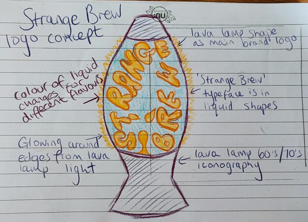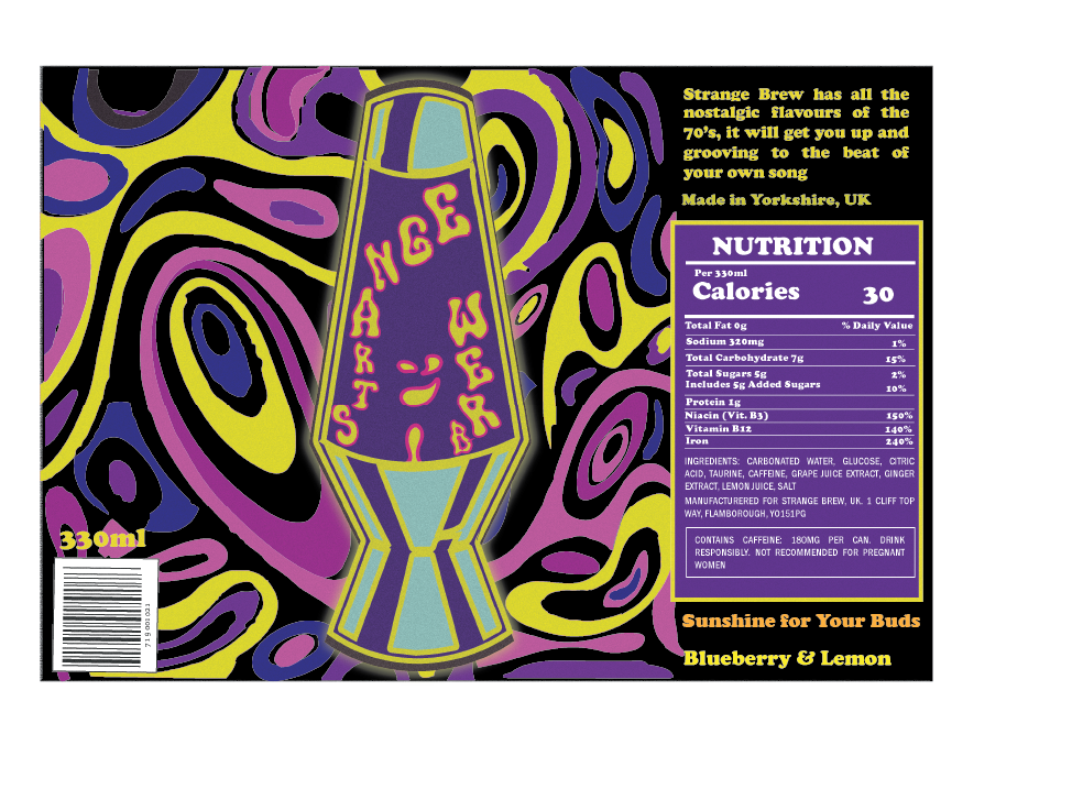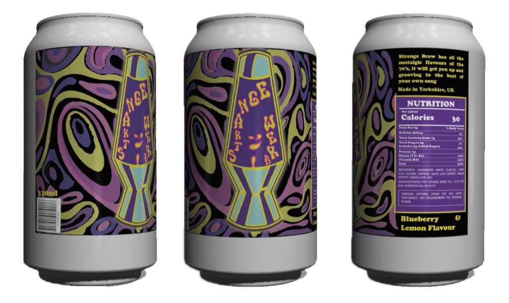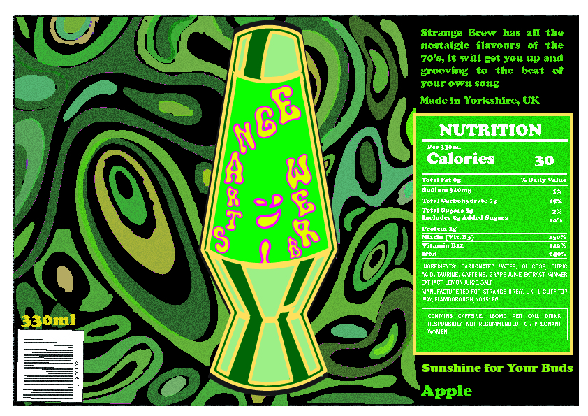
The initial concept design for Strange Brew focuses on the audience of consumers over 60 years old. The design will be explored digitally to produce branding which visually represents and appeals to the intended target audience.

The first design of the label was based on the idea that the ‘Strange Brew’ logo would be the main feature of the can and have a glow effect to give the impression of the light given off by a lava lamp. This was to have the logo as the main focus of the label, the iconography of a lava lamp is synonymous of the 60’s/70’s and was a common household decorative item associated with hippy and youth culture. This iconography is important when advertising Strange Brew to consumers over 60’s as they would have been the youth when this lamp was invented.

The final version of the logo uses flowing shapes in the background which compliment the text ‘Strange Brew.’ The typeface of ‘Strange Brew’ is flowing shapes of liquid, the letters are formed and flowing in the lava lamp, with a winking face in the middle of the lamp formed in liquid too. The addition of more visuals surrounding the lava lamp is based on a 60’s-70’s colourful and busy style poster aesthetic. These shapes have the suggestion of eyes and smiles, the idea delivered to the consumer is that they will be happy, chilled and relaxed after drinking. The slogan ‘Sunshine for Your Buds’ is a play on words inspired by the Cream song ‘Sunshine of Your Love.’ This song will be familiar to consumers over 60 as it was and still is a very popular song of the 1970’s. It is another indicator that Strange Brew is aimed at consumers over 60 years old. The logo, colours, background swirls, typography and slogan all work together in a visual symphony to help the consumer remember good times. The final aim when drinking Strange Brew is that the drink will invigorate their taste buds to remind them of nostalgic flavours from the 1970’s. The best before information will be at the base of the can and is not pictured on the 3D models.


