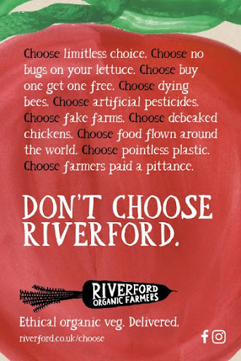
Riverford is an organic farm shop and restaurant, providing fruit and vegetable mail order boxes, sustainable packaging and charity partnerships.
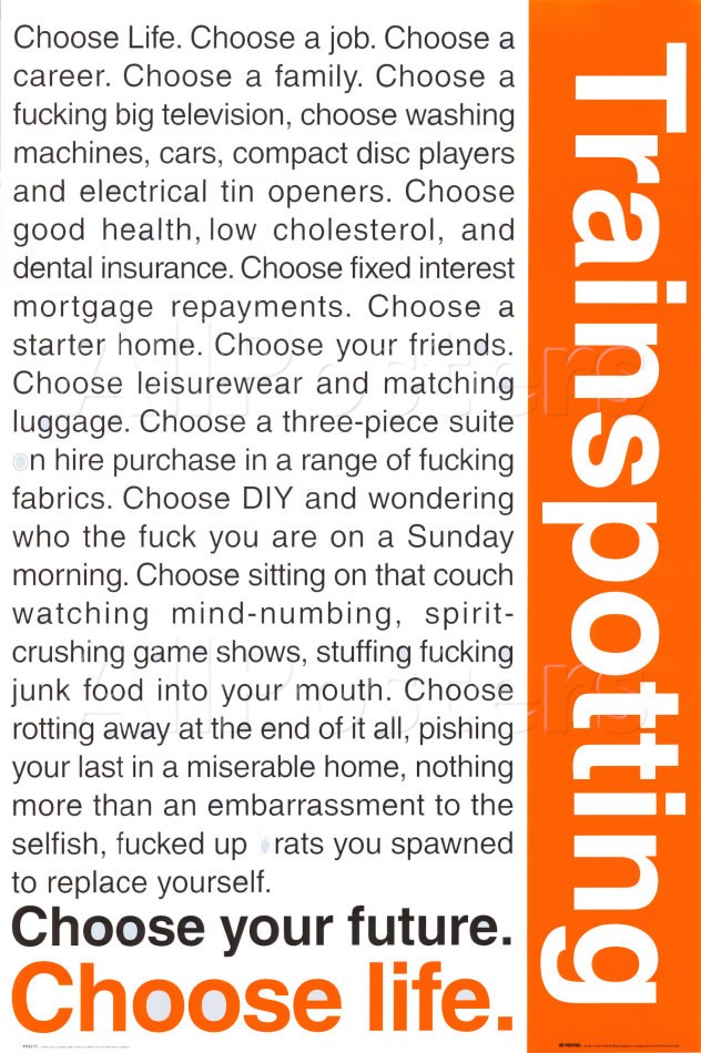
The ‘Don’t choose Riverford’ is a new twist on the Trainspotting ‘choose life’ 1996 film poster. This composition challenges the audience with the anti text in white, it is an alternative visual design used to highlight the issues with industrial practices in modern farming. In the words of Robert Henri “Good composition is like a suspension bridge; each line adds strength and takes none away… Making lines run into each other is not composition. There must be motive for the connection. Get the art of controlling the observer – that is composition.”
The watercolour background of a tomato creates a striking backdrop for the bold black and white text. Red is a primary colour, it is “extreme and used to capture attention, as used in stop signs or warning labels” (J.L Morton). The green at the top of the poster represents the vines of the tomato, highlighting the poster relates to vegetables. The black and white text creates a vibrant contrast with the extreme of the red background. The black ‘choose’ text correlates to the ‘Riverford organic farmers’ logo, it leads the eye to Riverford, away from the negatives relating the industrial farming practices.
Gullivers farm shop is a market garden, farm shop and deli kitchen in East Dorset, UK.
The logo is basic in design, lacks colour and composition. Below are the steps for redesigning the logo.
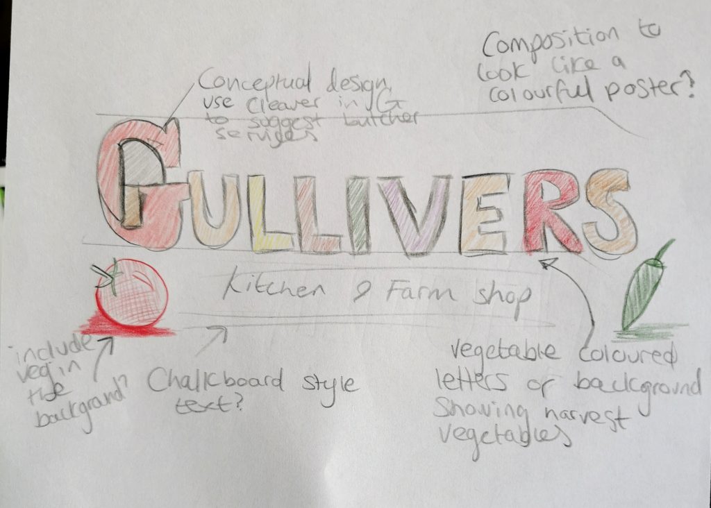
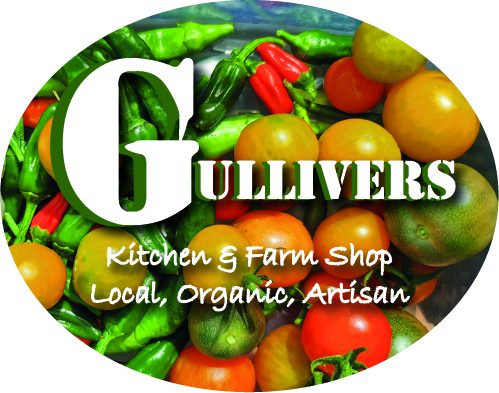
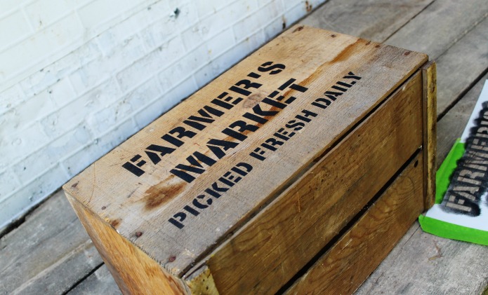
The ‘Gullivers’ typeface is a stencil style, similar to the vegetable box text labels used in market gardens. The ‘G’ has been edited to show a cleaver, it is a subtle display of conceptual deign that references a butcher, whose produce is sold in the farm shop. The ‘Kitchen farm shop’ and ‘Local, organic, artisan’ typeface represents chalk handwriting, it has an independent market aesthetic. The white colour is used to be highly legible ,the clarity of white also signifies the lack of chemicals used in organic farming.
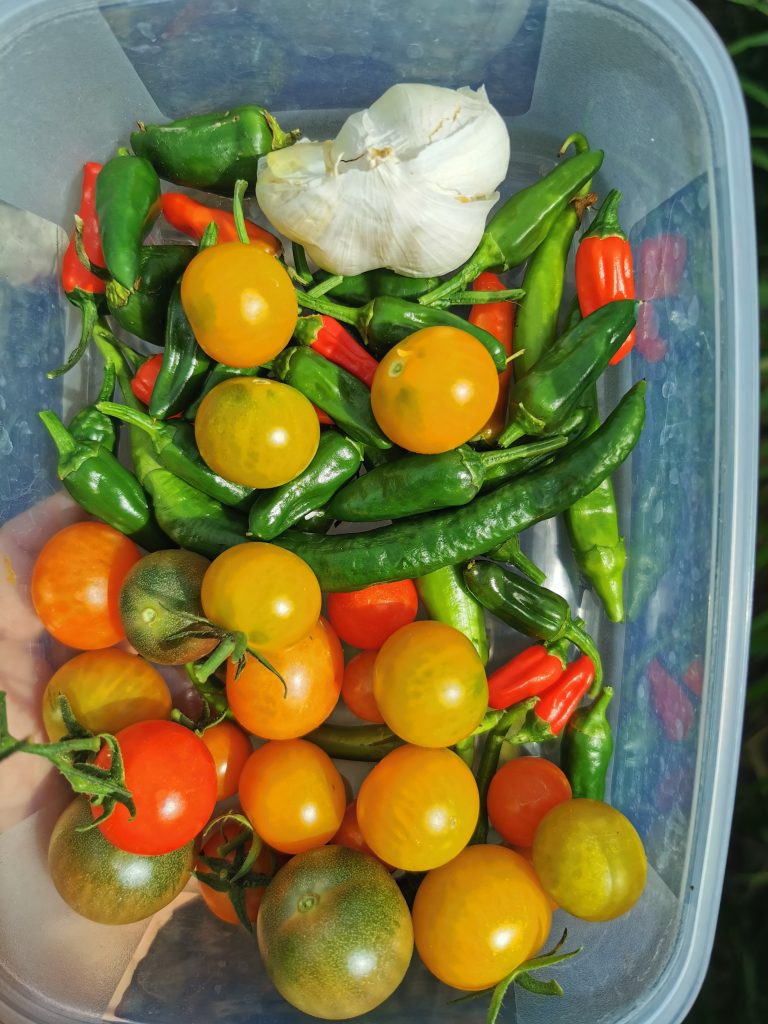
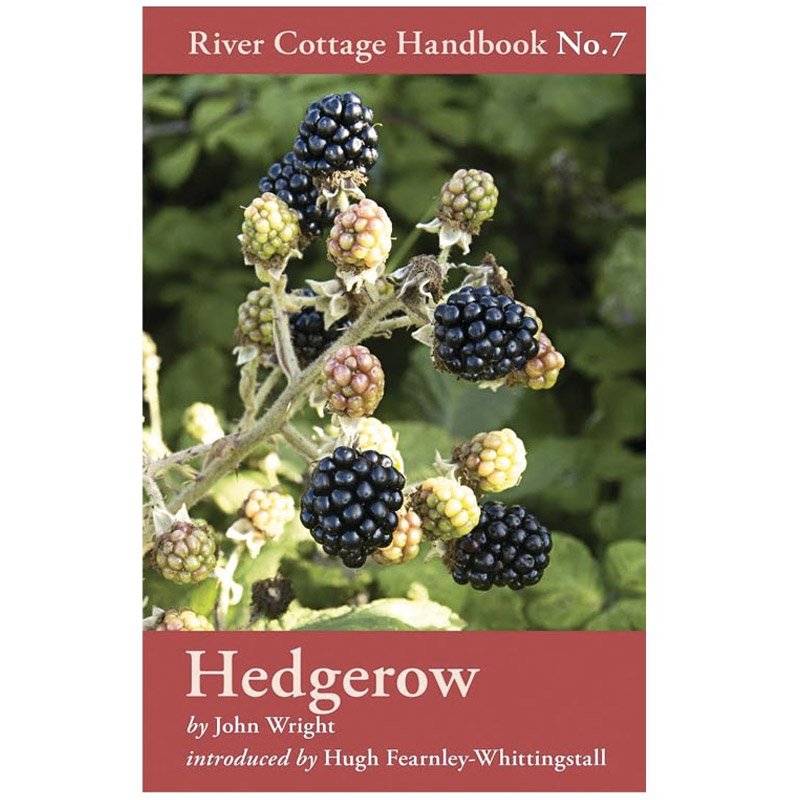
The background image has a warm, seasonal colour pallete from the vegetables. The colours are vibrant and lush, showing the abundance of an organic harvest. The design colours create a comfortable feeling, representing home grown, cooked food. The design is inspired by the Hugh Fearnley Whittingstall River Cottage Handbooks. A simplistic image with text.
References
About Riverford n.d [Online] Available at: https://www.riverford.co.uk/ (Accessed 27 October 2021)
About us. n.d. [Online] Available at: https://gulliversfarmshop.co.uk (Accessed 25 October 2021)
Fred Searle. Fresh Produce Journal. 9 September 2019. [Online] Available at: http://www.fruitnet.com/fpj/article/179666/riverford-launches-provocative-new-ad-campaign (Accessed 28 October 2021)
Hedgerow Book photo reference n.d [Online] Available at: https://www.rivercottage.net/books (Accessed on 29 October 2021)
J L Morton The Meanings of Red n.d [Online] Available at: https://www.colormatters.com/the-meanings-of-colors/red (Accessed 28 October 2021)
Robert Henri Quotes n.d [Online] Available at: https://www.goodreads.com/author/quotes/112030.Robert_Henri (Accessed 28 October 2021)
Vintage Farmhouse Living. 28 May 2017. [Online] Available at: https://knickoftime.net/2017/05/farmers-market-farmhouse-style-decor.html (Accessed 29 October 2021)
Alex Suskind. 17 March 2017. [Online] Available at: https://www.vice.com/en/article/ypkxn5/the-story-behind-the-groundbreaking-trainspotting-poster (Accessed 30 October 2021)
