
The energy drink will target an audience of consumers over the age of 60.
Below are some words and phrases to initiate he thinking process of designing a brand name and logo.
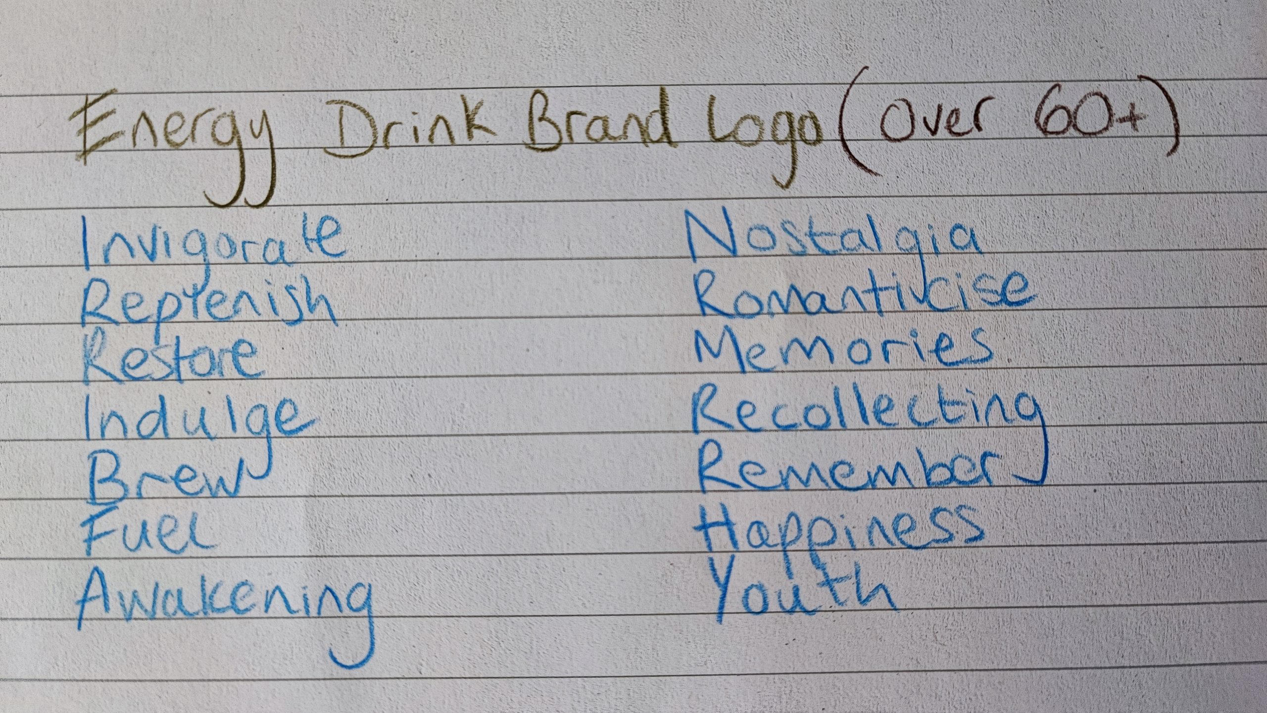
A consumer over 60 may not drink an energy drink for the same reasons as someone younger who may use it for high intensity sports or work. The target audience may want the drink for a recipe and aesthetic from their youth, it will be a drink that not only invigorates but creates happiness through nostalgic flavours and branding.
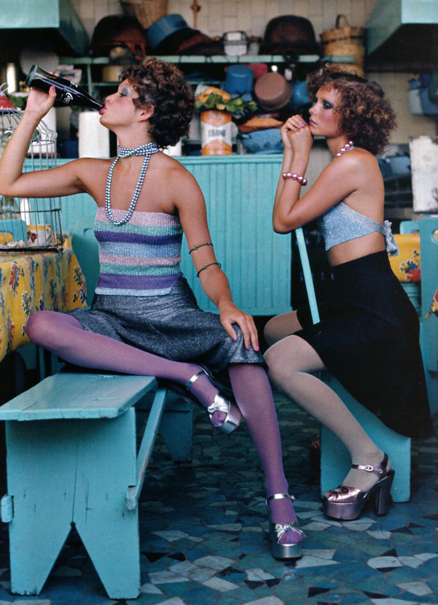
The two main words to focus on from figure 1 will be “Brew” and “Nostalgia.” Themes to focus on will be flavours and movements from the 1970’s. This was over 50 years ago, therefore a person who is 60 plus would be in their youth and experience a wide range of media and musical influences.
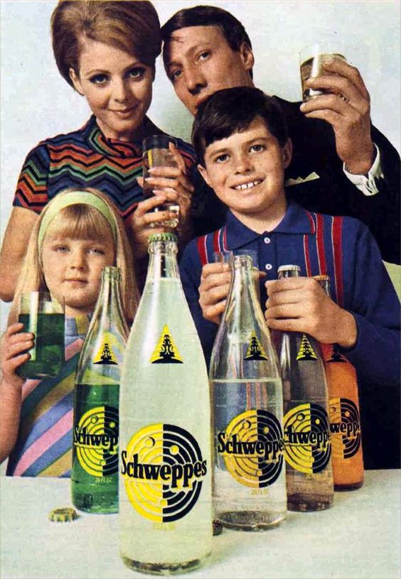
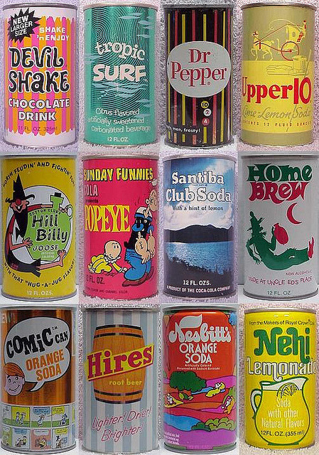
The drinks from the 60’s-70’s feature the classical glass bottle with a bottlecap or the aluminium ring pull can. There are advantages and disadvantages to both types of packaging. The glass bottle would be the most nostalgic to use however there are issues concerning weight, storage and durability. The initial idea for the design was to use a glass bottle in the shape of a lava lamp. However a metal can is lighter, smaller, easier to hold, which could be much more beneficial to the consumer over 60, especially if they have accessibility issues such as arthritis. Therefore the energy drink packaging will be in a 330ml aluminium can.
The name “Strange Brew” will be the name of the drink. This name is based on a Cream song “Strange Brew” from the 1967 album Disrali Gears.
The typography and colours of the branding are inspired by the psychedelic and rock music of the 60’s and 70’s. The curves letters which flow in different shapes and sizes will be the main focus of the branding.
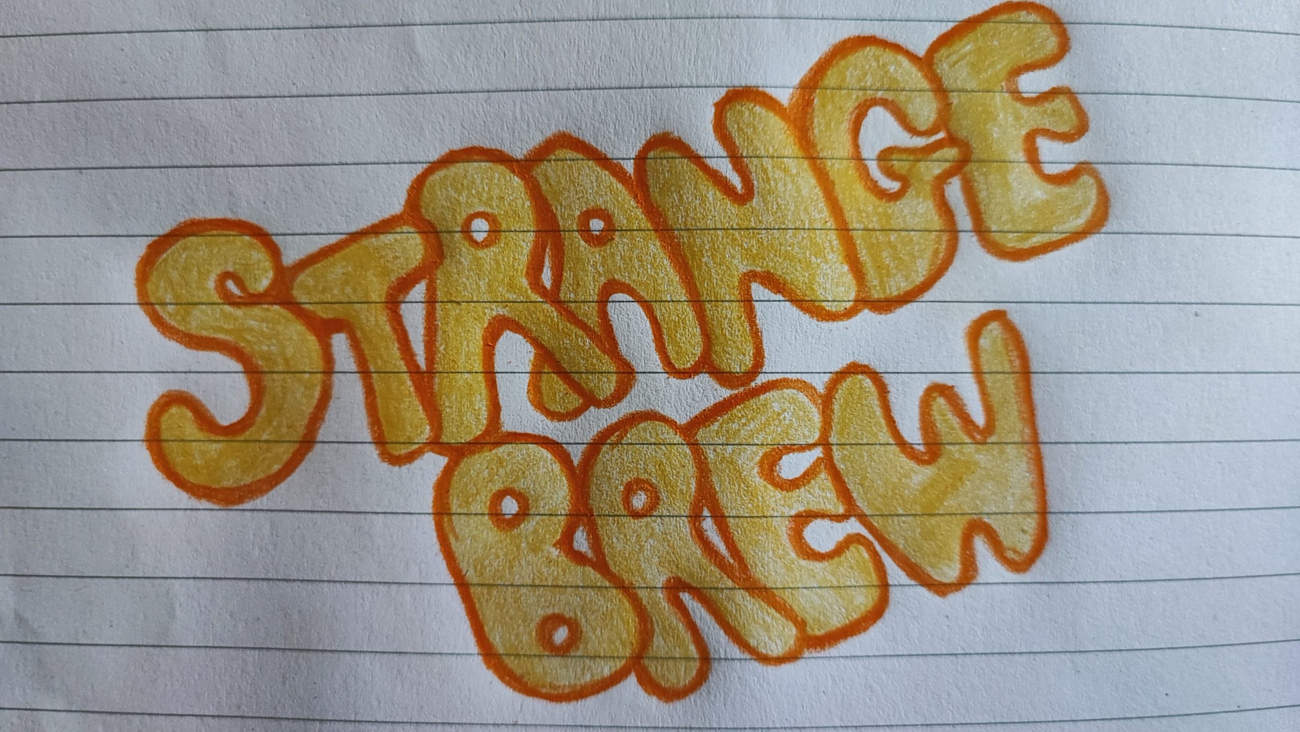
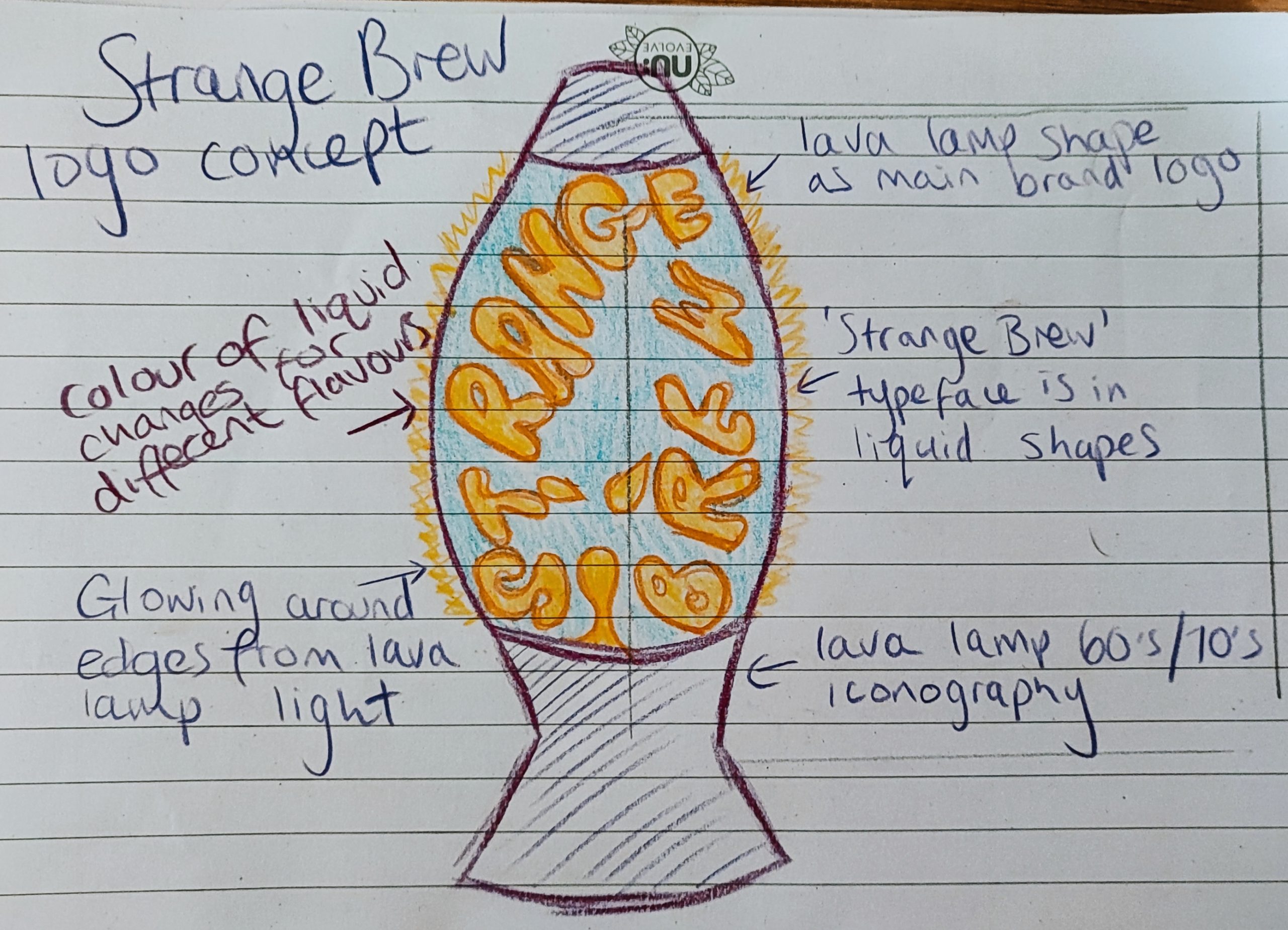
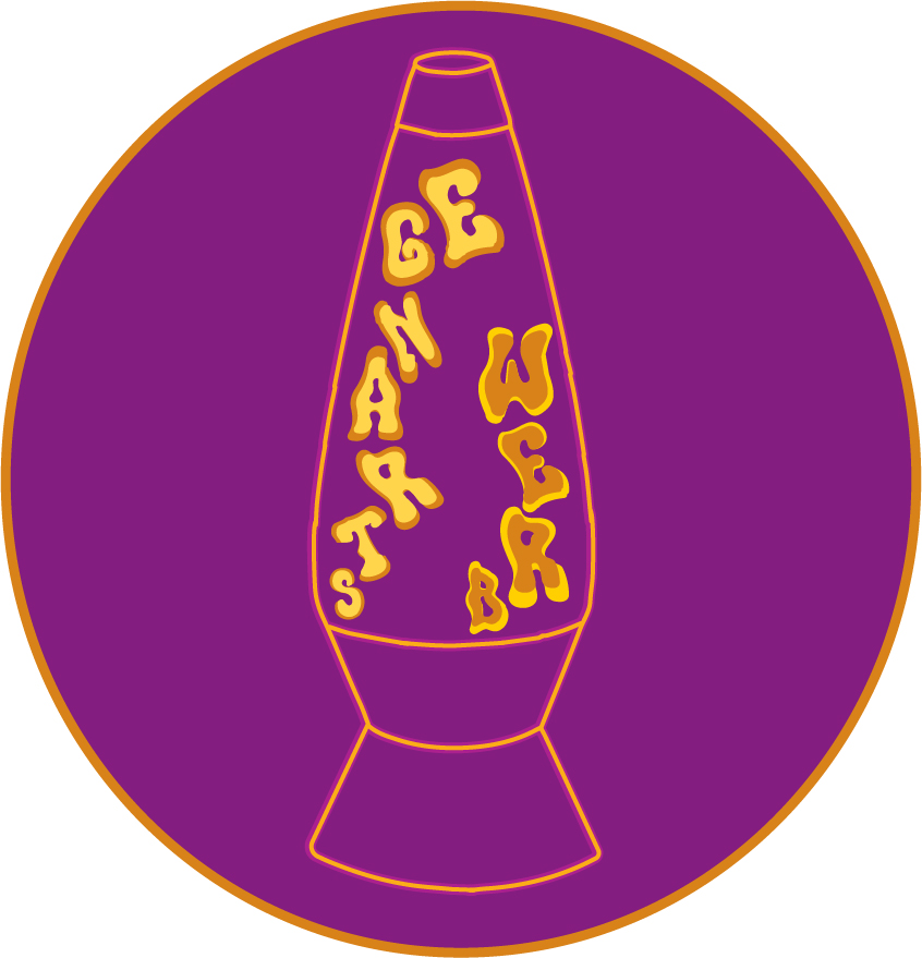
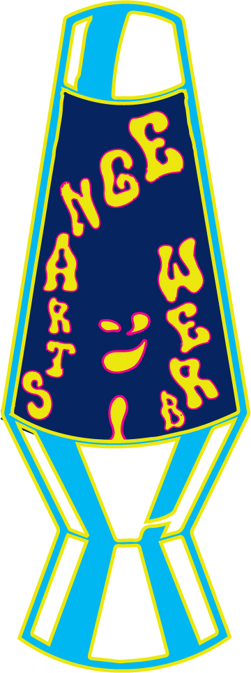
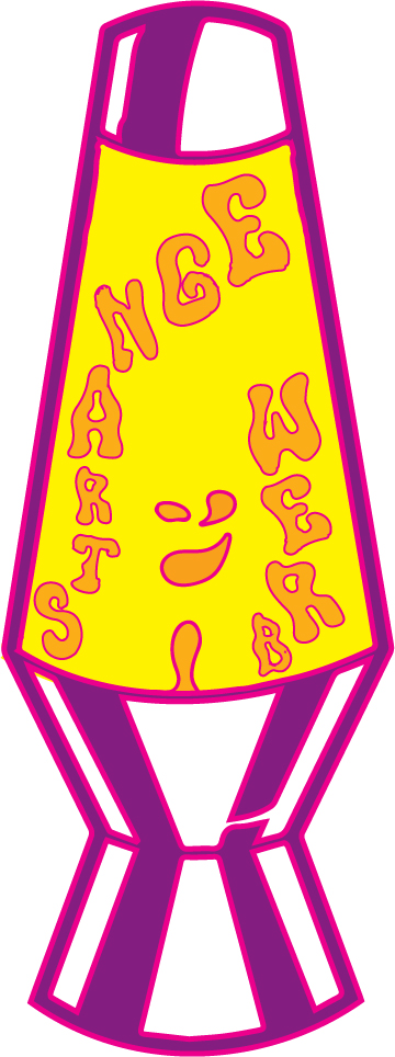
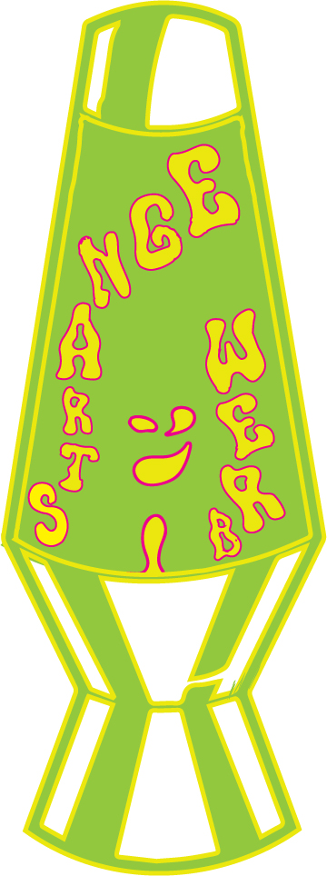
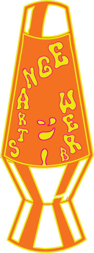
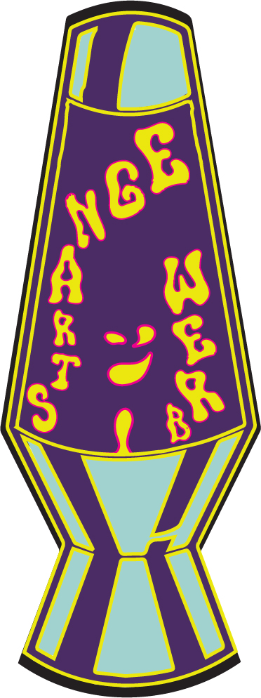
The colours of the logo are changed easily to signify the different flavours available. There is a smiling and winking face in the liquid of the lava lamp which shows good feelings and happiness after consuming the drink. More ideas will be explored when designing the label packaging ideas.
References
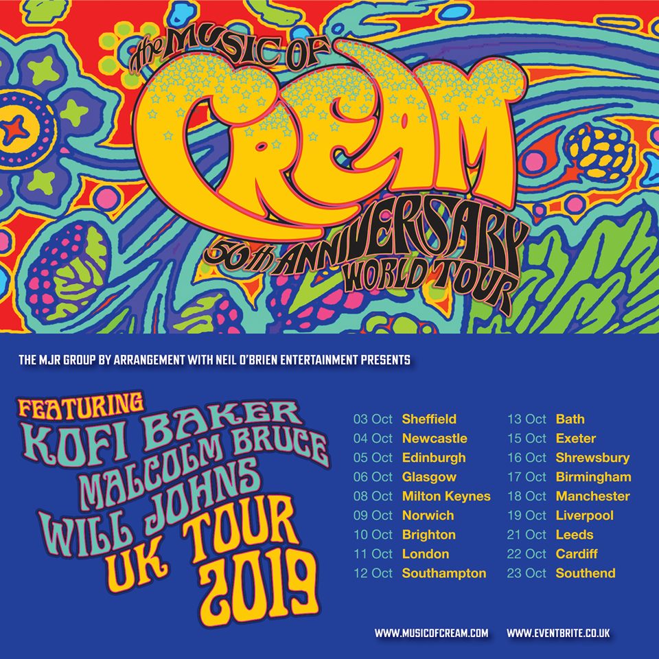
Online: Home- https://www.pxfuel.com/en/query?q=classic+rock+album+covers [Accessed on 26 March 2023]
Online: Home- https://flashbak.com/soda-yesteryear-people-soft-drinks-1960s-70s-3894 98/ [Accessed on 24 March 2023]
Online: Home- https://flashbak.com/soda-yesteryear-people-soft-drinks-1960s-70s-3894 98/ [Accessed on 25 March 2023]
Online: Home; Drink Cans- https://en.wikipedia.org/wiki/Drink_can [Accessed on 27 March 2023]