
The following post will discuss how Tufte’s five theories have been incorporated into the final 3D metamorphosis animation.
Colour


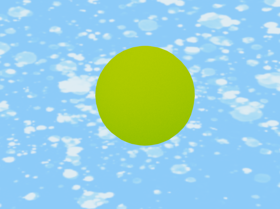
Tufte’s first theory relating to the use of colour is expressed in every scene in the animation, as suggested in Tufte. E.R., 1990. Envisioning Information “Nature’s colours are familiar and coherent, possessing a widely accepted harmony to the human eye.” The colour palette used in the metamorphosis animation stays true to his principles. This is demonstrated consistently throughout the whole animation. The main colour scheme for the background and sky is lighter blues and whites which are colours found in nature. These colours suggest the sky which is familiar to the human eye and blue has a calming element when thinking about moods on the colour wheel. Yellow is a warm colour that suggests happiness on the colour wheel. It also represents the yellow of the cheese which is the object forms in scene 1 and scene 5. The sun is also yellow and radiates heat so is also linked to the colour properties relating to warmth and happiness.
Small Multiples Encourage Comparison
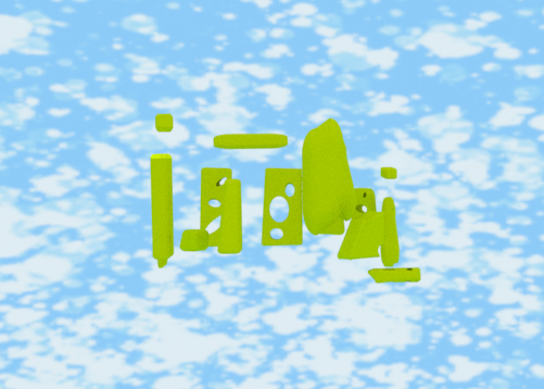
The Swiss cheese Stonehenge can relate to Tufte’s second theory relating to multiples Tufte. E.R., 1990. Envisioning Information “Small multiples are the best design solution”. As shown in Scene 1, there are small multiples of the yellow cheese Stonehenge pieces, they are similar in colour, size, and shape but none are identical.

Narratives of Space and Time
The panorama used in the fly-by camera angle of Scene 3 demonstrates the understanding of Tufte’s third principle when observing narratives of space and time. In this scene the panoramic viewpoint as the sun is also spinning displays how the “aesthetics of information is enriched by examining narratives and their visual texture.” Tufte. E.R., 1990. Envisioning Information.

Layering and Separation
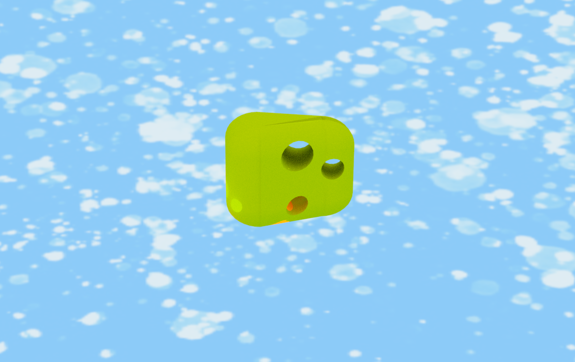
The three colours used in the animation are blue, white, and yellow. This makes the animation easy to follow and understand in its bold simplicity. As Tufte suggested “the effectiveness and elegance of small spots of intense, saturated colour for carrying information.” Tufte. E.R., 1990. Envisioning Information. This enables Tufte’s fourth principle to be utilised. This is particularly notable in the 3D models which morph into different shapes, all of the different shapes share the same yellow colour.

References
Book- Tufte. E.R., 1990. Envisioning Information (Accessed 12/05/2022)
Online – Home, A Complete Colour Guide, https://feltmagnet.com/drawing/choose-the-right-paint-color (Accessed 12/05/2022)