
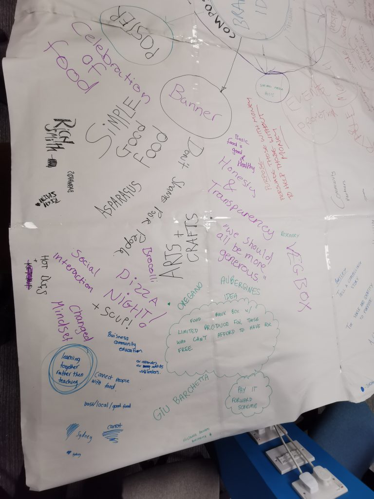
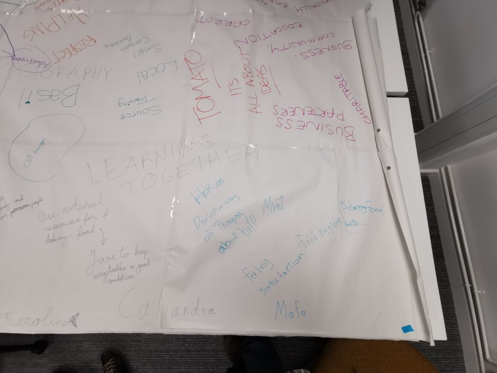
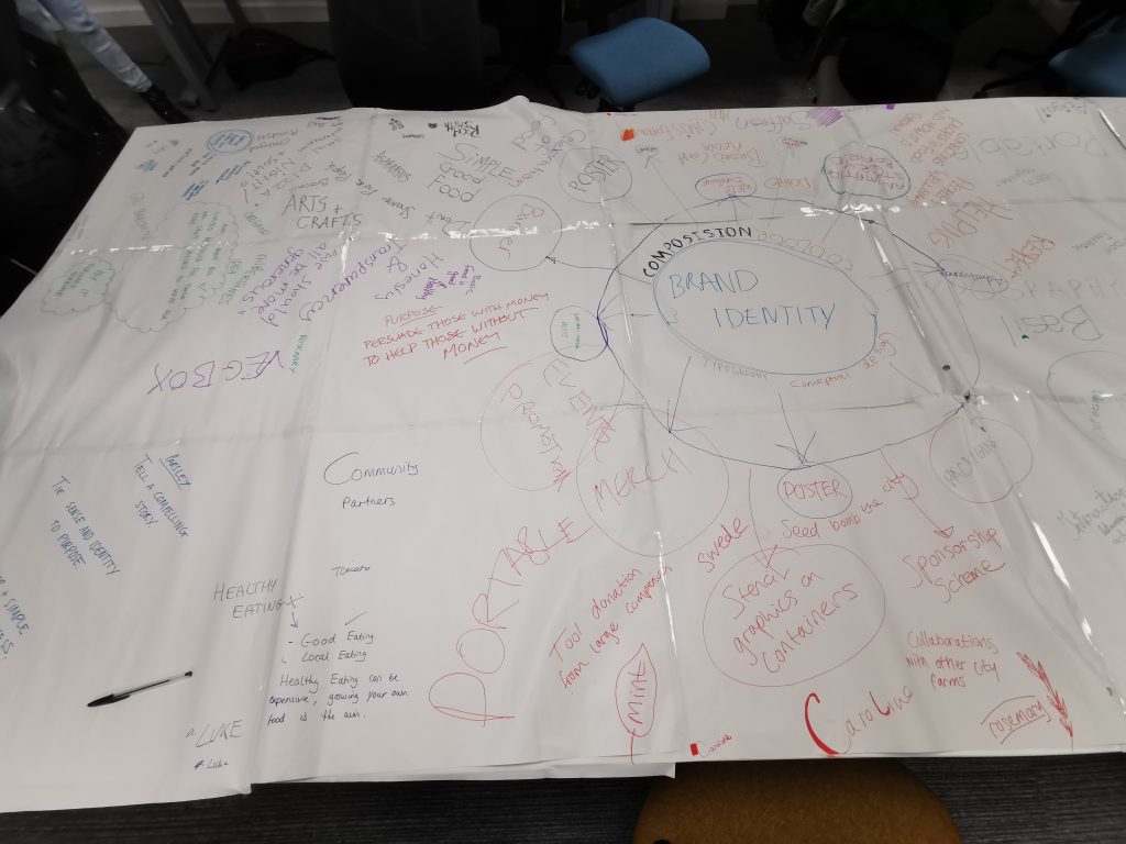
The masterplan is a collection of ideas to highlight ways to help Rooted in Hull with design solutions for their issues regarding funding, advertising and growth. The end goal would be for funding, in the words of Adrian Fisher “How to get people who have money to donate.”
The masterplan would be one that takes the viewer away from a standard corporate design, whilst still showcasing elements of typography, colour, composition and conceptual design which are within Rooted in Hulls graphic design manual.
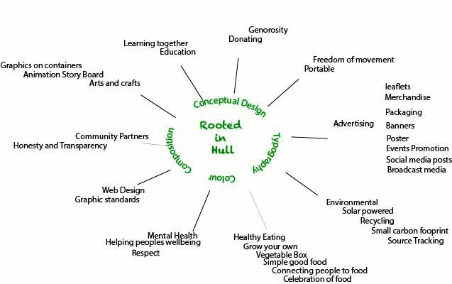
The first design takes some of the key points from the analogue masterplan and sorts them into relevant categories and sub-categories. This organises them into more structured and legible ideas, which can be expanded and explored further along in the design process. This is the first step in the design process, to arrange the text before adding colour and choosing a typeface that will be consistent throughout the rest of the project.
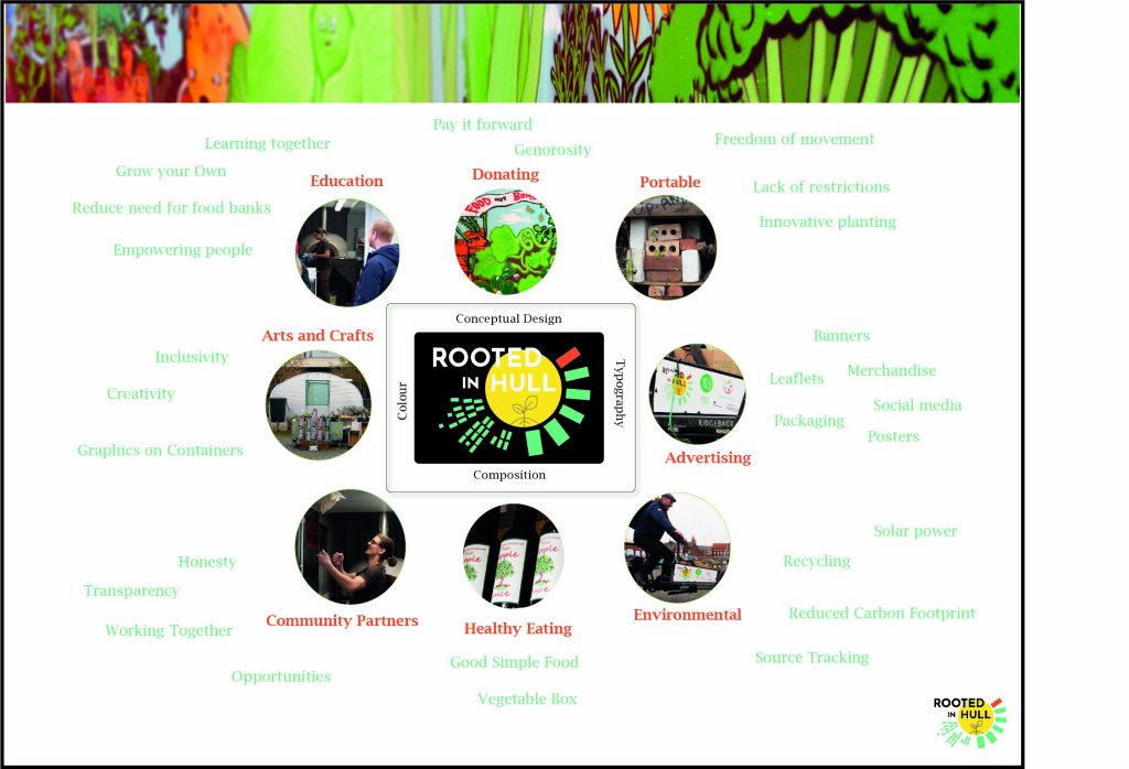
The second masterplan design was created after the field trip visit to Rooted in Hull. The opportunity to talk to Adrian Fisher and Sherard of ‘The People’s Pizza’ vastly improved the design ideas. Their feedback enabled a better understanding of the outcome of the project. The new plan uses photos taken on the day to visually assist the viewer when looking at the different categories, as well as showcase some of the exciting activities happening at the farm. The colour scheme for the text uses the red and green from the containers on the Rooted in Hull logo, creating a direct visual link to the urban farm. The typeface is Lucida Bright, which is used throughout the full design process in both The People’s Pizza and Rooted in Hull design work.
This typeface is easy to read, crisp and clear, without looking too formal. The use of a graffiti header adds to creating a masterplan that is one removed from the corporate world. The header uses a cross section taken from a photo of a mural on the farm, this uses highly vibrant colours, and creates a lively, fresh and vibrant aesthetic.
The use of the logo on a black background is purposeful to make the logo more noticeable, with the circular photos surrounding it, almost suggesting the shape of a flower and it’s petals, another link towards the farm and their produce.
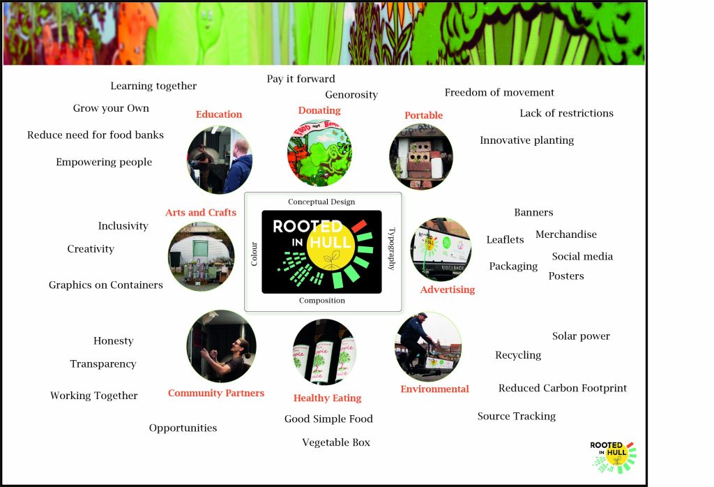
The final design has some slight changes. Most noticeably the text in the subcategories is now black. This makes the text more legible; the green was intended to be used to incorporate the Rooted in Hull colours, however it is not as clearly legible as the black. This masterplan summarises the qualities and aims of the farm, and is a great starting point for the rest of the project.