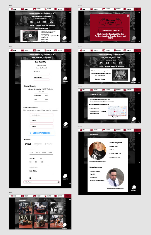
Post One; Website Design art work development

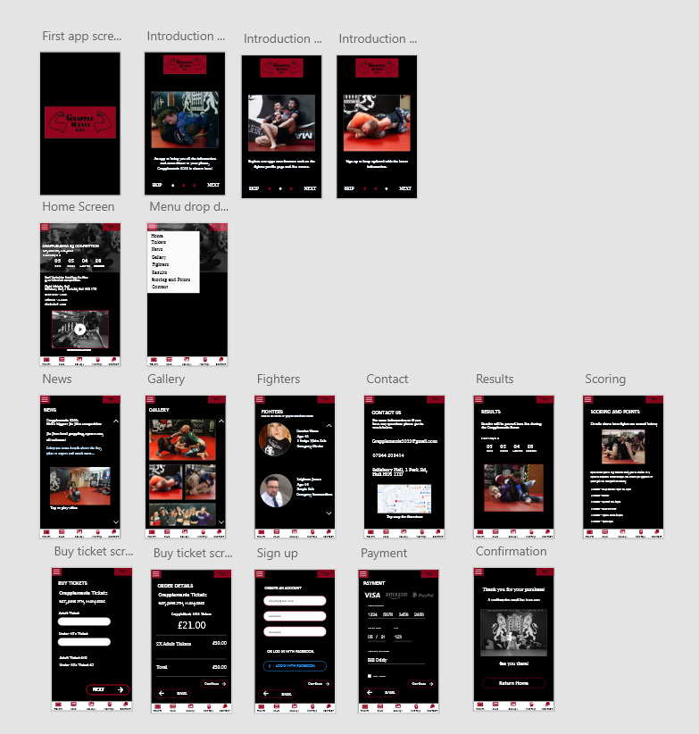
The website has been designed to use a minimal amount of screens, with the relevant information contained in the different screens which can be located on the top bar of the screen.
The home screen has various interactive call to action options for the stakeholder. The user journey to purchase a ticket can be accessed with a call to action ‘BUY TICKETS HERE’ button or the tickets icon on the navigation menu bar.
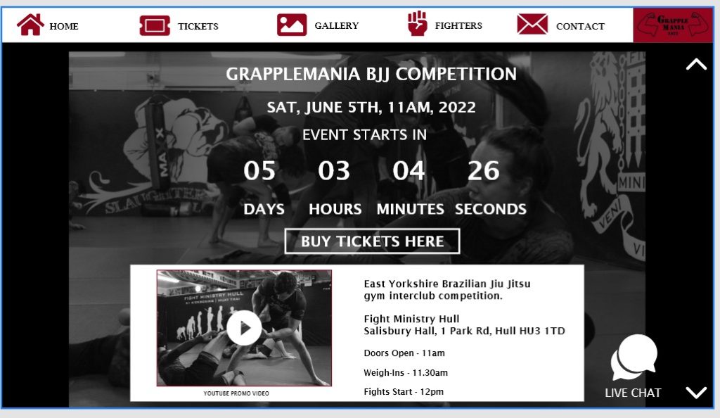
The menu bar at the top of the screen uses icons and text, this is so users can immediately navigate the different pages, with the use of text and symbols it appeals to a wider age range of stakeholders. The website is designed to be useable for people of all ages. The reduced colour scheme seeks to address issues regarding accessibility. The text in white is easy to read, it is always against a black or dark background. The typeface used is Lucida Bright, a sans serif style which is highly legible, with the most important information displayed large in the middle of the screen. There is the option to change the website to an audible version which can be accessed via the live chat pop up which is large and visible on all screens.
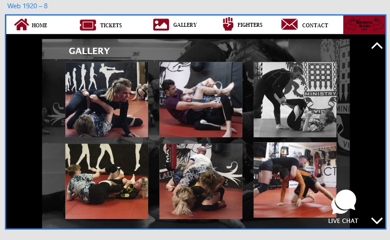
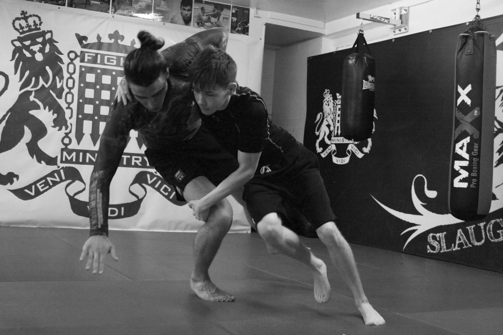
The colour scheme used is red, black and white. This scheme was chosen to create maximum contrast so that the important information (event date, countdown) is clearly legible and visible to a wide range of stakeholders. The colours used is the colour scheme of the Fight Ministry gym where Grapplemania is being held. This can be recognised in the photos used in the website gallery too, where the mats of the gym are red and the walls black. This creates a colour consistency between the gym and the Grapplemania website which can be instantly recognised by the fighters and members of the gym. Also historically recognised as the colours worn by boxer Mike Tyson who famously fought in black and red.
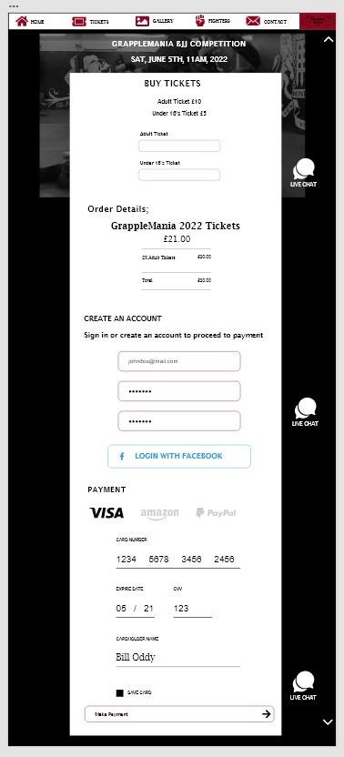
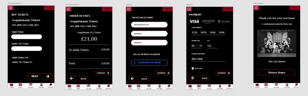
The user journey to buy a ticket is designed to require the least amount of inputs, which will make purchasing a ticket quick and easy. The order process is contained on one screen which scrolls down. There is the option to sign in using Facebook, which will autofill most of the information needed. The main input required by the stakeholder is the number of tickets and method of payment, which if using PayPal will be even quicker.
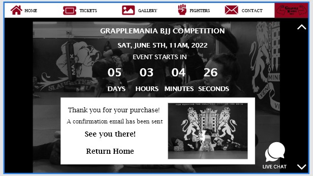
After purchasing a ticket a confirmation screen will let the stakeholder know the transaction has been successful and they can return to the home screen.
Post Two; App Design art work development

The app is designed to be more user interactive than the website, with information and notifications being directly available to the user via their handheld devices. In comparison to the website there are more screens, interactions and live feedback, which is only available after downloading the Grapplemania app.
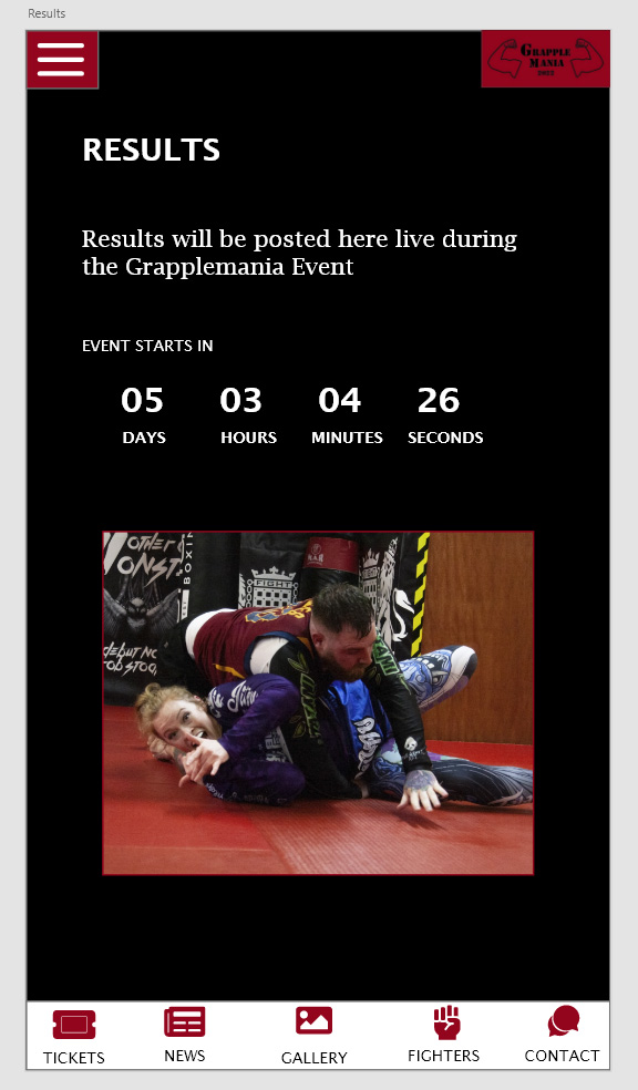
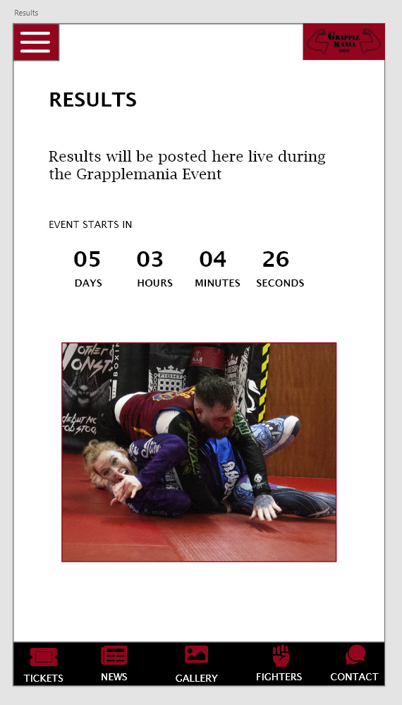
The app is minimalistic but highly functional, it does not bombard the user with text, but further information is availble on the different screens of the app. On the day of the event the app will be useful for notifying users of live scores. In addition live videos of each fight will be recorded and available for download via the app results screen.
The user journey for buying a ticket is short, over four screens. The input from the user is minimal, with only the essentials required for purchasing a ticket. Auto-fill information makes the process quicker by signing in with Facebook, following a confirmation text and email.
The colour scheme, icons and photos used in the app are the same as the website to create a visual consistency in line with the graphic standards of the website and app.
The app has two user menus, a drop down menu and a footer menu with icons and text. This is to ensure that the users find it as easy as possible to navigate the app screens comfortably in whichever way they prefer and are familiar with. This also addresses accessibility issues, such as visual impairment, dyslexia and reading difficulties. The app can be navigated by easy to recognise icons to give the user two choices through the menu bar. The app has the capability of haptic feedback or voice control which will be available on the contact screen.
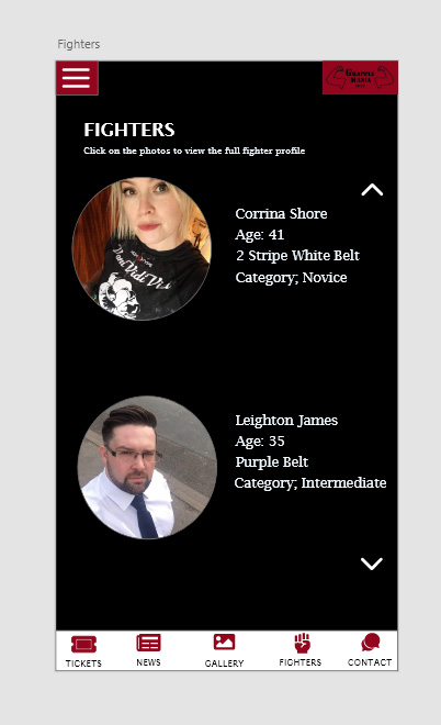
The fighters screen contains subcategories which can be explored further by selecting the image to view more fighter profiles and who they are competing against. This will provide more extensive information for those who are interested. Some of which will include the following categories; weight, age, gender, ability e.g. novice, intermediate, high level.
Post Three; Website and App design styles
As noted above, the website and app share the same colour theme, typography and photography, icons and functionality.
The three colours used (red, black and white) are purposeful to give a bare roots, simplistic aesthetic to the design of both. The black background and white text was chosen as it creates a high contrast classic look, as well as making key information highly visible and legible in white text. This is the opposite way around in the footer text which is a white background with black text. This was designed to provide maximum contrast between the screens and the menu icons to navigate the app and website. The app has been user tested to a group of fifteen, who voted the black background and white text was more stylish, memorable and legible than the inverted white background and black text alternative displayed below.
The typeface is Lucida Bright, a sans serif typeface which was selected for its simplicity, legibility and familiarity with stakeholders. This is intended to create a sense of trust subconsciously with users as they will be more willing to read and absorb the information if its familiar and easy to read and understand. The amount of text is minimal and not too overbearing for the user, with more information available the further into the app the user explores. The news page on the app will contain the main bulk of the text, with regular updates posted on there which is also available as an email newsletter for users who choose to sign up.
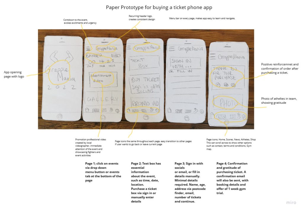
The app was expanded from the original paper prototype version, with more screens, including three initial onboarding screens were added as well as extra icons to more easily navigate the app.
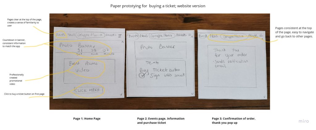
Below shows how the app was expanded from the initial paper prototype.
The photography used are all taken by Caroline Arnott, who trains at the Fight Ministry gym; she is able to take candid, in action photographs of the fighters which gives the gallery a sense of realism and displays to the user what to expect from the gym facilities and the fighters.
Post Four; User Testing
The website and app have been tested on an audience of fifteen people, a mixture of gym members, users with no experience of Jiu Jitsu and age ranges of 16 to 65. Some of the observations and adjustment’s to the design are discussed below.
The website originally began as having more screens and information. The feedback overall suggested that the users preferred less text, with more photos and interactive choices. The initial mid-fidelity website prototype contained a large news page, extensive scoring and results page as well as a forum and members chat. These additional pages were removed in the final design, instead to be used in the app.
The final design of the website seeks to deliver all the relevant infomation of the festival (location, buy tickets, gallery) whilst seeking to onbaord the user to download the accompanyting app.
The app has been designed to be more interactive and informative before and during the event. It has a larger number of screens compared to the website, with more information and user journeys to travel through.
The feedback from the app testing revealed that the users were overall satisfied with the aesthetic and functionality of the app. When timing the process to purchase a ticket to the app, the median time was 25 seconds. This is an improved time from the paper prototype, the use of auto fill and less input options is a result of this. The users requested a functional gallery, which when clicking on the photos, the name of the fighter and name of the submission or move is named after clicking. The users preferred that the app did not have animation in the form of flashing and bouncing images, this was one of the early ideas for the festival countdown text. The only use of animation is a subtle fade out when clicking to the next screens and vise versa.
Some original screens on the app have now been removed after user testing, such as the pop up share screen, which appeared after five seconds to the user for them to share the event on social media.
The testing also highligted some of the issues with the app wiring, which have now been corrected so that all of the icons and menu bar is now fully functioning without issue.
Post Five; Conclusion
The website and app of Grapplemania together make am informative, educational and entertaining platform for the many stakeholders of the event. The app will notify users of updates if kept installed. Upcoming events, recommendations for similar local events, newsletter and a discount code for other purchases will keep the app relevant and used.
The app could be developed into a community hub space, with free gym trials gifted once the app is installed, this will bring revenue to Fight Ministry and grow the interest of the sport of Brazilian Jiu Jitsu to Hull and it’s surrounding areas.