
Onboarding Analysis
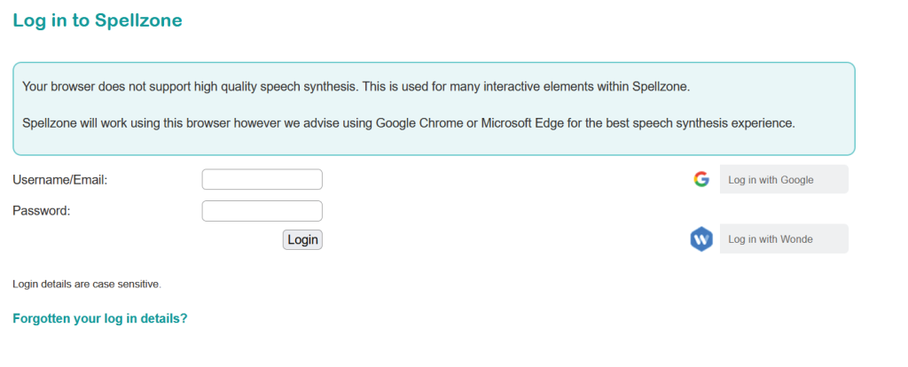
The onboarding and design is basic but functional, with the user being able to log in with an email/username and password. It allows users who are students, teachers to sign up easily. There is a free trial available which provides an incentive for potential members to experience the services before buying.
The design of the onboarding does lack colour, design and animation, but it serves it’s purpose. The login page retains the green text colour scheme which is consistent throughout the whole website, however this can be changed on the accessibility tab.
Target Market
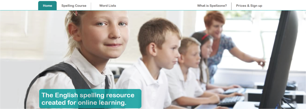
From the first page of the website the image for the header makes it clear that the website is aimed at school children and teachers. Although Spellzone would also be beneficial for people learning English as a second language too.
Improving User Experience
In groups we discussed how the website could be improved to appeal to a larger target audience. The website has illustrations that would appeal to children but doesn’t facilitate an older audience. Some improvements that could be made include; three pages to access when on the landing page, this would be two separate pages for different aged users and one for teachers. An increased use of icons, which would be helpful for people learning English as a second language, for example a flag icon could acess a page where instructions are translated automatically in their language.
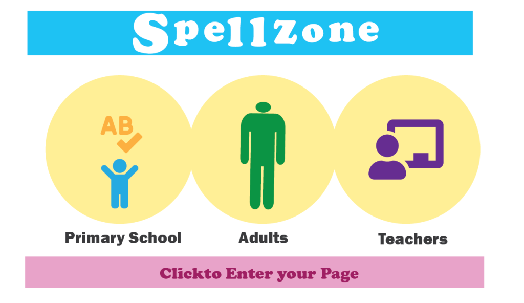
Improvement Examples
The image below is an example of a potential new landing page for spellzone, it would split into three different pages for the user to visit, and deliver a more tailored experience for each different user. For example the Primary School page will have leader boards with a points/rewards system for completing tasks, It would have animated games and be colourful to keep the child engaged. The adults page would be more useful in helping them learn English for practical skills which would be useful in every day interactions. It would use flags to select the users first language so that they can navigate the page and access the right tests easily. The teachers page would be more of an administration page to veiw students progress and deliver rewards. An accompanying app would also be useful so that users could access the site in any location so that learning isn’t restricted to a class room or pc.
References
Spellzone; Home (2023) Available online: https://www.spellzone.com/index.cfm [Accessed 7 Jan. 2023].