

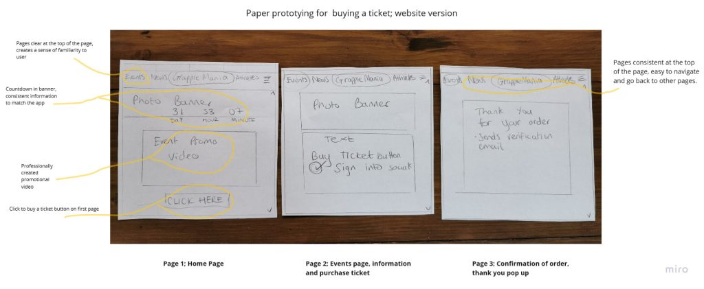
Paper Prototypes
The below paper prototype shows a design that uses minimal screens for the process of buying a ticket. The home screen contains a direct link to purchase a ticket and it can also be accessed on the Events tab in the menu at the top of the page. The app is designed to mirror the website, although the app contains less text and is more image and link clickable based. The content is designed to be accessible for all stakeholders, with the call to action of buying a ticket being easy to find on the first page.
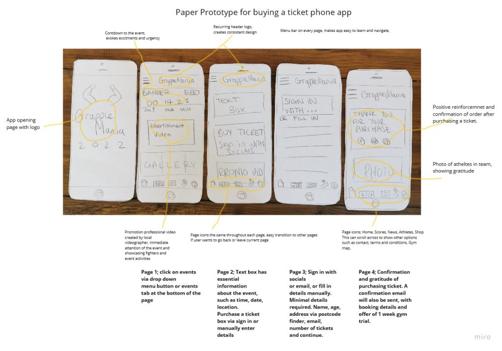
The app paper prototype is designed to be direct and functional. The process of buying a ticket is minimised to four journey screens (excluding the opening app screen, which can be lost for less screens.) The amount of user interaction has been kept minimal as possible to reduce frustration and keep the user engaged whilst browsing. There is the option to access the different pages on every screen via the icons at the bottom of the screen or menu bar which will be consistent throughout each page.
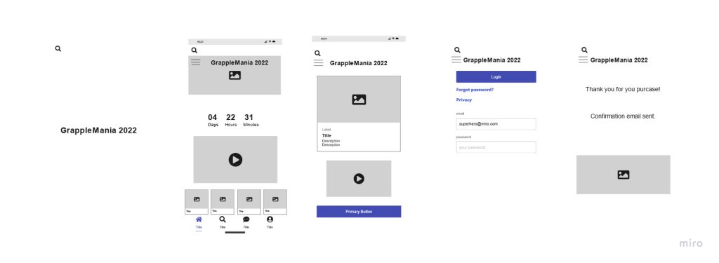
Above is a wireframe version of the app, this is a low fidelity design that shows some of the features. It can be easily edited and changed by others, even stakeholders, such as the marketing and photographers, who might add their own information to the app.
Stakeholder Constraints
The pathway to purchasing a ticket is designed to be purposefully direct and with minimal choices. The user interface is simplistic with minimal text and information. The minimalistic approach serves to accommodate for users with accessibility issues too. This design was trailed on 3 participants, the time taken to purchase a ticket via a sign in with social media was on average 30 seconds, delivering a much more satisfactory user experience.