

Low Fidelity rejections
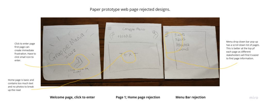
The below is a selection of rejected pages for the website. The opening page with the click to enter may initially annoy the stakeholder entering, it is a small icon to enter the website, which could be an issue for those with accessibility problems. It also serves little purpose and adds to the time taken to complete the task of purchasing a ticket. The home page contains text with no images or colour, it is a factual page and evokes little excitement about the event. The menu drop down bar which scrolls up and down could be difficult to navigate and locate for some users.
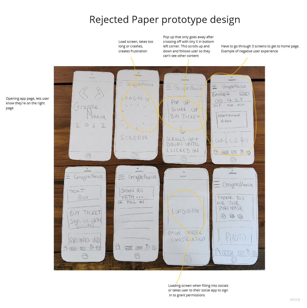
The above paper prototype is purposefully in conflict with the ideas from Hick’s Law. There are too many pages and stimuli, which takes users longer to make a decision. One particular annoyance would be the pop up which scrolls up and down the page with the user and has only a tiny x to remove the pop up. This would cause issues for users with accessibility problems such as visual impairments.
This prototype was tested on 3 individuals. The average time taken to buy a ticket is 2 minutes when manually entering information to buy a ticket. One common feedback issue was the amount of time taken to purchase tickets through load screens and frustrating pop ups.